Chapter 17 Bonus chapter: ggplot2
Looking for plotting examples online, you will most likely find solutions including the ggplot2 package instead of the base R solutions you learned in this class.
The package can be either installed directly with install.packages("ggplot2") or within another popular package for data manipulation we’ve just talked about: tidyverse (install.packages("tidyverse")).
The ggplot2 syntax follows slightly different rules than the plot() function, but feels more intuitive for some users.
One of the main differences to base R is, that it does not take vectors as an input. Therefore, your data has to be in a data.frame. This can be an advantage when you load large tables and want to group different aspects without much data manipulation.
So let’s load some example data: the “iris”-flower dataset contains data from 3 species of iris, containing sepal length, sepal width, petal length and petal width (in cm):
> library(datasets)
> data("iris")
> head(iris)
  Sepal.Length Sepal.Width Petal.Length Petal.Width Species
1          5.1         3.5          1.4         0.2  setosa
2          4.9         3.0          1.4         0.2  setosa
3          4.7         3.2          1.3         0.2  setosa
4          4.6         3.1          1.5         0.2  setosa
5          5.0         3.6          1.4         0.2  setosa
6          5.4         3.9          1.7         0.4  setosa
We will now plot the iris sepal length against the sepal width with different shapes and colors for each species.
Just like in base R, we will first define the plotting area:
aes stands for aesthetics and defines all visual properties that are part of the source dataframe. Petal.Width and Petal.Length are column names from the data frame.
Now let’s add some data points to the plot and define that the color and shape should be defined by the column named “Species”:
> ggplot(iris, aes(x=Petal.Width, y=Petal.Length)) +
+ geom_point(aes(color=Species, shape=Species), size=2)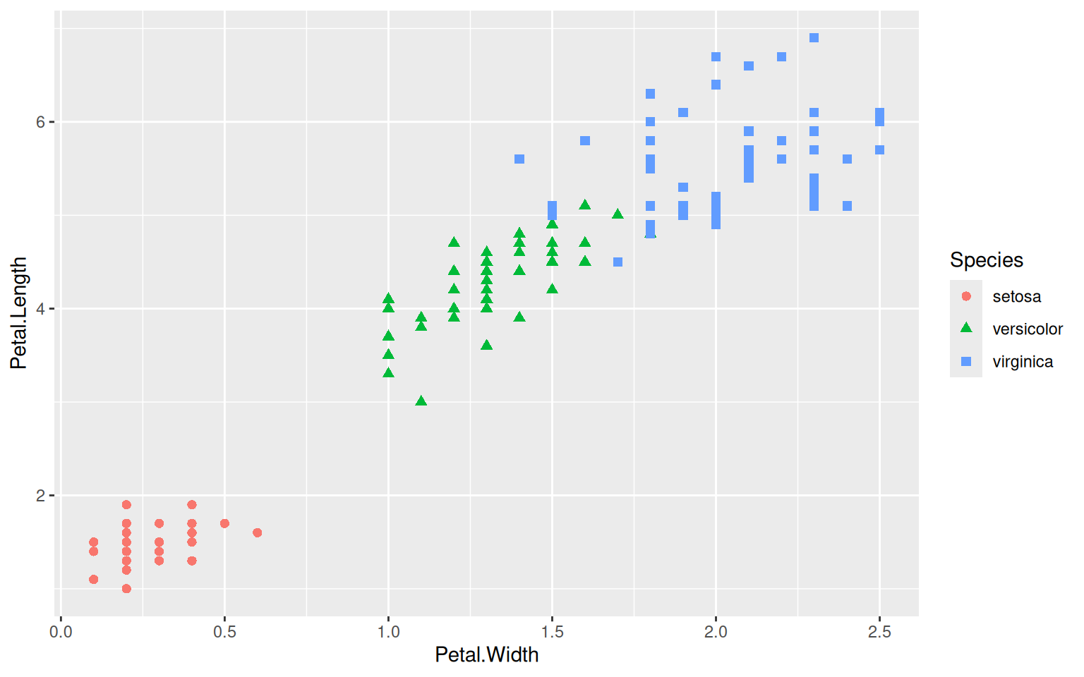 Another difference to base R plotting is, that every element added to the plot has to be added directly to the main plot with a
 +, adding as many layers to the plot as desired.
In the above case, geom_point draws points. There are many more geom layers that can be drawn like geom_line for lines or geom_bar for bar charts. You can find a complete list at https://ggplot2.tidyverse.org/reference/ .
Of course we will need to add some titles and rename the axis. The colors can be set manually with scale_color_manual or taken from a color brewer palette (scale_color_brewer).
> ggplot(iris, aes(x=Petal.Width, y=Petal.Length)) +
+   geom_point(aes(color=Species, shape=Species)) +
+   scale_color_brewer(palette="Dark2") +
+   ggtitle("Iris populations", subtitle="Petal width vs petal length") +
+   xlab("Petal width") + ylab("Petal length")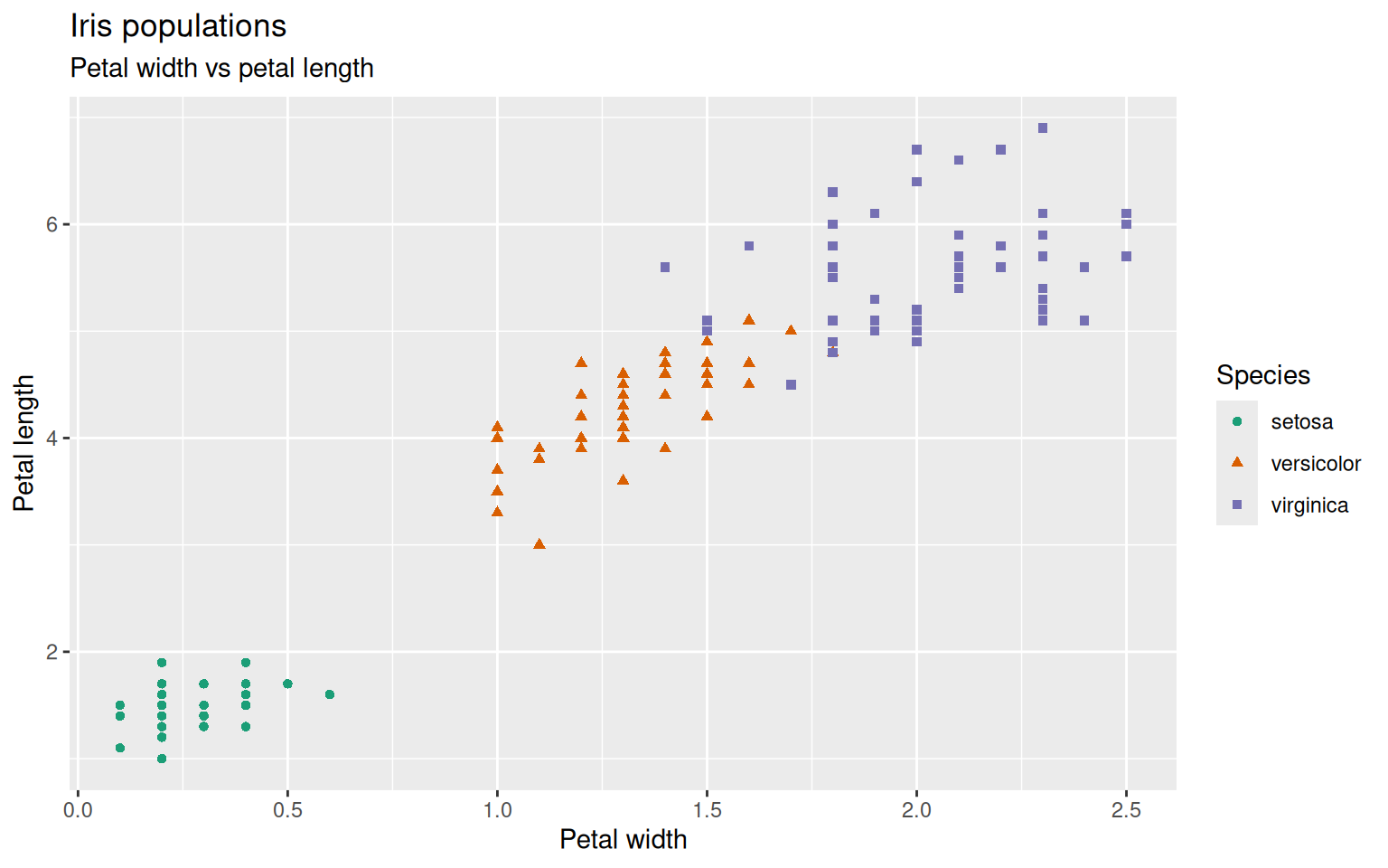
The whole appearance of the plot can be changed by changing the theme of ggplot.
There are multiple predefined themes to choose from. Here are some examples but also within the predefined themes everything can be changed and adapted to your needs:
theme_grey() is the default, theme_bw(), theme_light(), theme_dark(), theme_minimal(), theme_classic(), theme_void(), theme_test().
You can play around which theme you like most.
Within the theme-argument you can define background colors, gridlines, text sizes, etc.
> ggplot(iris, aes(x=Petal.Width, y=Petal.Length)) +
+   geom_point(aes(color=Species, shape=Species)) +
+   scale_color_brewer(palette="Dark2") +
+   ggtitle("Iris populations", subtitle="Petal width vs petal length") +
+   xlab("Petal width") + ylab("Petal length") +
+   theme_bw() +
+   theme(axis.text.y=element_text(angle=90, hjust=0.5)) # turn y-axis text by 90 degrees and adjust horizontally by 0.5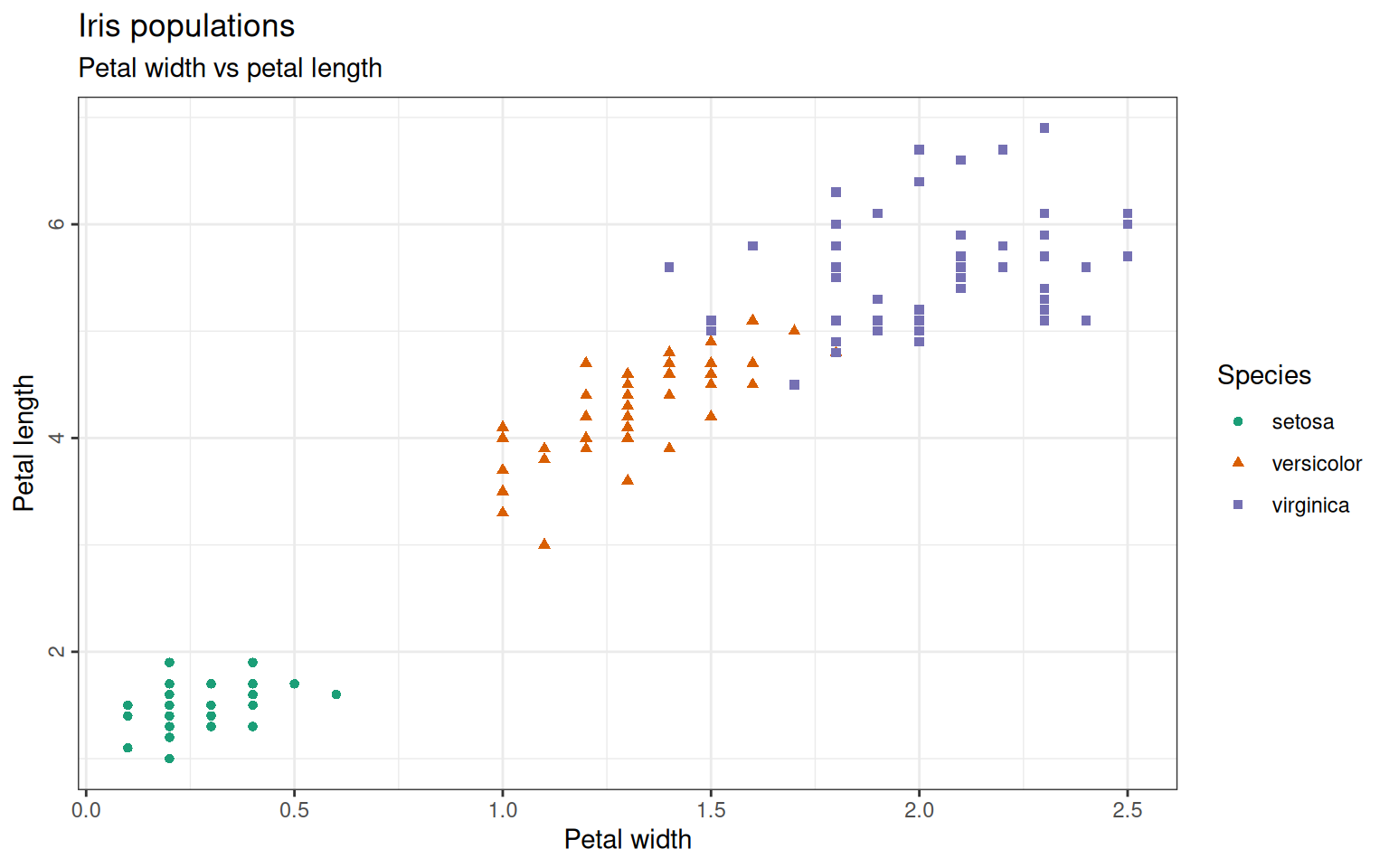
Maybe we also want to add another column to our plot: The sepal width should be displayed as a gradient color by defining it in the aestethics from geom_point. The same way, stroke, shape and size can be used to discriminate groups within the dataset. The colors can be customized with the scale_color argument.
> ggplot(iris, aes(x=Petal.Width, y=Petal.Length)) +
+   geom_point(aes(color=Sepal.Width, shape=Species)) +
+   scale_color_gradient(low="blue", high="yellow") +
+   ggtitle("Iris populations", subtitle="Petal width vs petal length and sepal width") +
+   xlab("Petal width") + ylab("Petal length") +
+   theme_bw() +
+   theme(axis.text.y=element_text(angle=90, hjust=0.5),
+                      legend.spacing.y = unit(0, "cm")) # decrease space between the two legends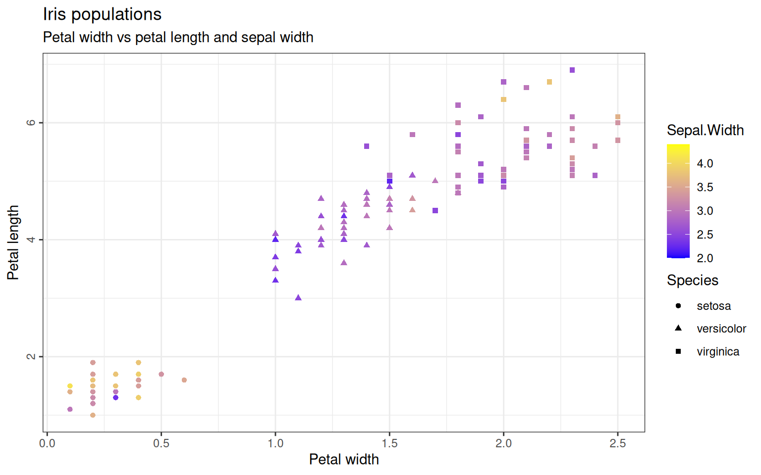
A ggplot can also be saved in a variable. The plot will then only be drawn once the variable is being called. Let’s save this scatter-plot for a later use:
> scatterPlot <- ggplot(iris, aes(x=Petal.Width, y=Petal.Length)) +
+                     geom_point(aes(color=Sepal.Width, shape=Species)) +
+                     scale_color_gradient(low="blue", high="yellow") +
+                     ggtitle("Petal width vs petal length and sepal width") +
+                     xlab("Petal width") + ylab("Petal length") +
+                     theme_bw() +
+                     theme(axis.text.y=element_text(angle=90, hjust=0.5), legend.spacing.y = unit(0, "cm"))
The three species could also be plotted in separate plots as a facet-grid and we could also add a smooth line. Let’s do this for a comparison of sepal length and petal length:
> ggplot(iris, aes(x=Sepal.Length, y=Petal.Length)) +
+ geom_point(aes(color=Species, shape=Species)) +
+ scale_color_brewer(palette="Dark2") +
+ ggtitle("Iris populations", subtitle="Sepal length vs petal length") +
+ xlab("Sepal length") + ylab("Petal length") +
+ facet_wrap(~Species) + #create one plot per species
+ geom_smooth(aes(group=Species), method=lm, formula='y ~ x', color='black') + #adding linear ('lm') smooth line in black
+ theme_bw() +
+ theme(axis.text.y=element_text(angle=90, hjust=0.5),
+ legend.position = "none") # suppress legend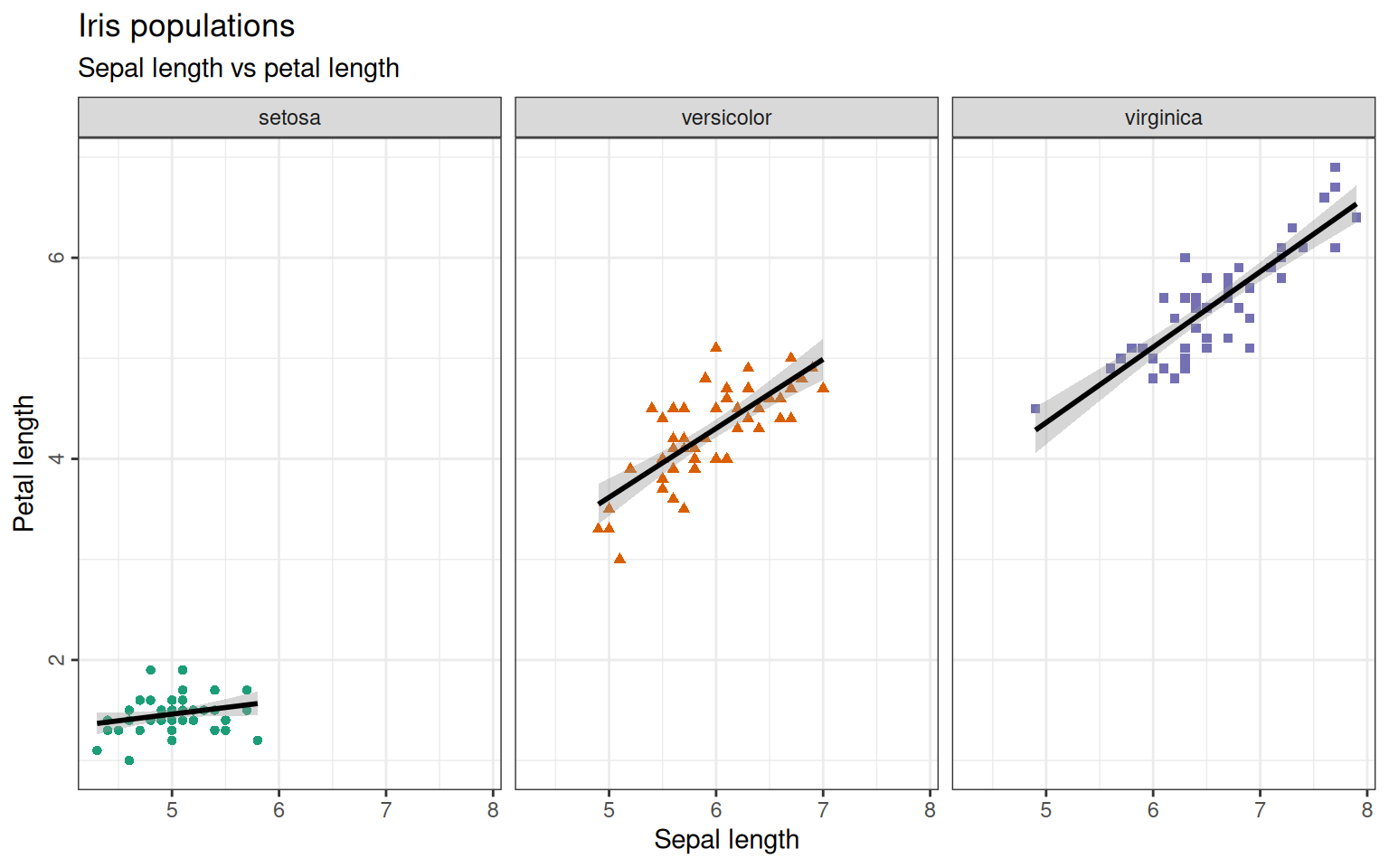 The
The method=lm argument is plotting a linear model to your data-points. You can fit different models to it like glm for generalized linear regression or loess for local regression or even a function you defined yourself. If you leave the argument out, the method is chosen by the program automatically.
Let’s save this scatter-plot for a later use:
> facetPlot <- ggplot(iris, aes(x=Sepal.Length, y=Petal.Length)) +
+                   geom_point(aes(color=Species, shape=Species)) +
+                   scale_color_brewer(palette="Dark2") +
+                   ggtitle("Iris populations", subtitle="Sepal length vs petal length") +
+                   xlab("Sepal length") + ylab("Petal length") +
+                   facet_wrap(~Species) + #create one plot per species
+                   geom_smooth(aes(group=Species), method=lm, formula='y ~ x', color='black') +  #adding linear ('lm') smooth line in black
+                   theme_bw() +
+                   theme(axis.text.y=element_text(angle=90, hjust=0.5),
+                                      legend.position = "none") # suppress legend
To draw a grouped boxplot for all sepal widths grouped per species we simply use the geom_boxplot function. We can also add the mean with the stat_summary:
> ggplot(iris, aes(x=Species, y=Sepal.Width)) +
+           geom_boxplot(aes(fill=Species)) +
+           ggtitle("Sepal width per species") + ylab("Sepal width") +
+           guides(fill="none") + # suppressing legend
+           stat_summary(fun=mean, geom="point", shape=1, size=3)+ #calculate the mean and plot it as a point of size 3
+           theme_bw()+ theme(axis.text.y=element_text(angle=90, hjust=0.5),
+                              axis.title.x=element_blank()) #supressing x-axis title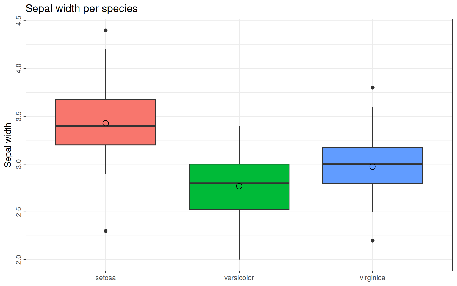
Saving this plot in a variable as well…
> boxPlot <- ggplot(iris, aes(x=Species, y=Sepal.Width)) +
+               geom_boxplot(aes(fill=Species)) +
+               ggtitle("Sepal width per species") + ylab("Sepal width") +
+               guides(fill="none") + # supressing legend
+               stat_summary(fun=mean, geom="point", shape=1, size=3) +
+               theme_bw() +
+               theme(axis.text.y=element_text(angle=90, hjust=0.5),
+                                  axis.title.x=element_blank()) #supressing x-axis title
With the additional package gridExtra (if it is not already installed, install with install.packages("gridExtra"), we can now combine the three plots from above:
> library(gridExtra)
Attaching package: 'gridExtra'
The following object is masked from 'package:dplyr':
combine
> grid.arrange(scatterPlot, boxPlot, facetPlot,nrow = 2, ncol=2,
+ widths = c(2, 1),
+ heights = c(1,1.5),
+ layout_matrix = rbind(c(1, 2),
+ c(3, 3)))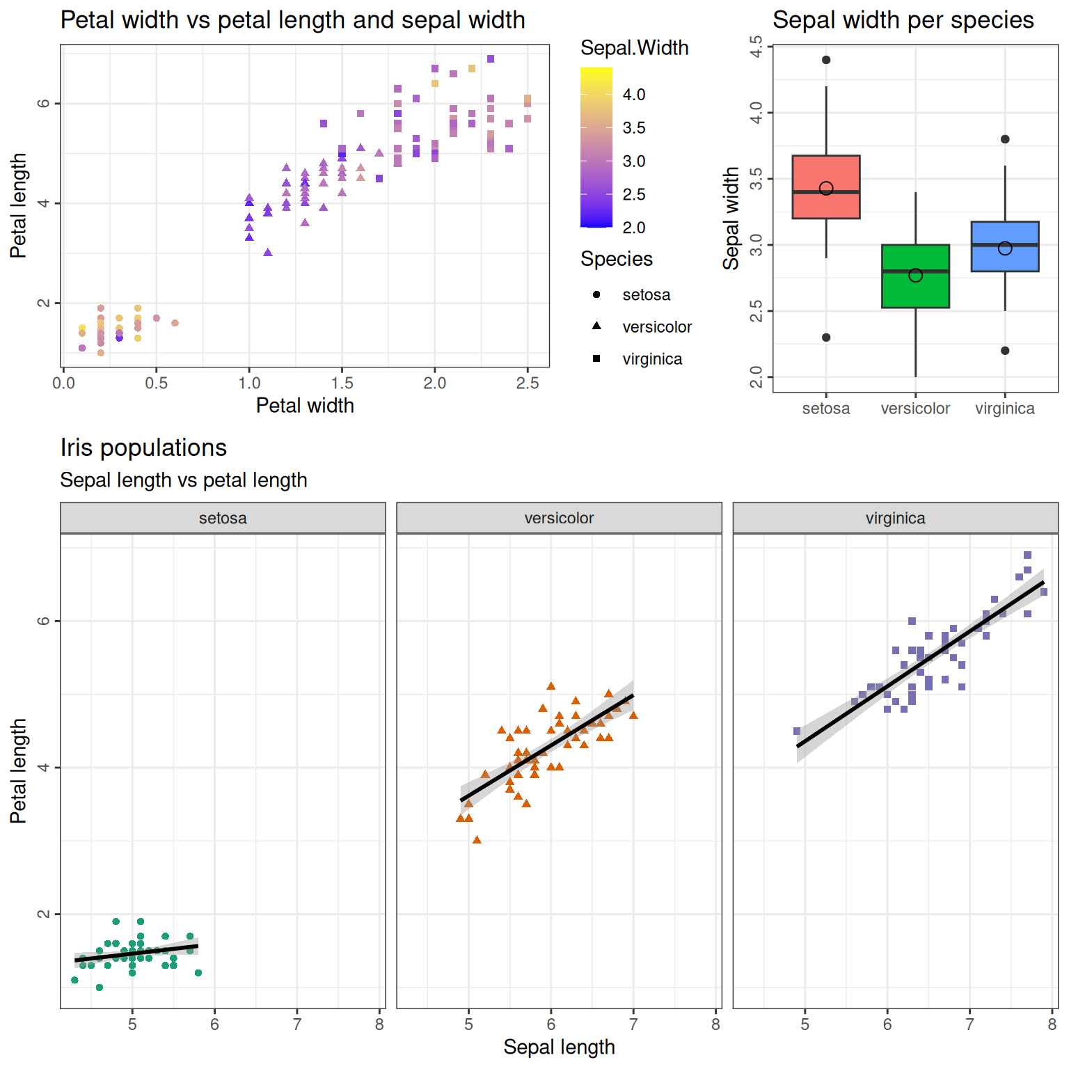 The
The nrow and ncol stand for the number of rows and columns in this plot.
The heights and widths parameters define, how the rows and columns should be distributed. E.g. widths = c(2, 1) means that the first column should be twice the size of the second.
The layout_matrix defines how the plots should be arranged, where the numbers represent the plots in the order they have been called.
So in this case, the first row contains the plots number 1 (scatterPlot) and 2 (boxPlot) in a ratio 2:1, and the second row contains the plot 3 (facetPlot) over both columns. The second row is 1.5 times the height of the first row.
17.0.1 Combining ggplot2 with other tidyverse syntax
You can take advantage of the synergy between ggplot2 and tidyverse. You can wrangle your data and then pipe it into ggplot2 all in one step.
> iris %>%
+   mutate() %>%
+   filter(Species != "versicolor") %>%
+   ggplot(aes(x=Species, y=Sepal.Width)) +
+               geom_boxplot(aes(fill=Species)) +
+               ggtitle("Sepal width per species") + ylab("Sepal width") +
+               guides(fill="none") + # supressing legend
+               stat_summary(fun=mean, geom="point", shape=1, size=3) +
+               theme_bw() +
+               theme(axis.text.y=element_text(angle=90, hjust=0.5),
+                                  axis.title.x=element_blank()) #supressing x-axis title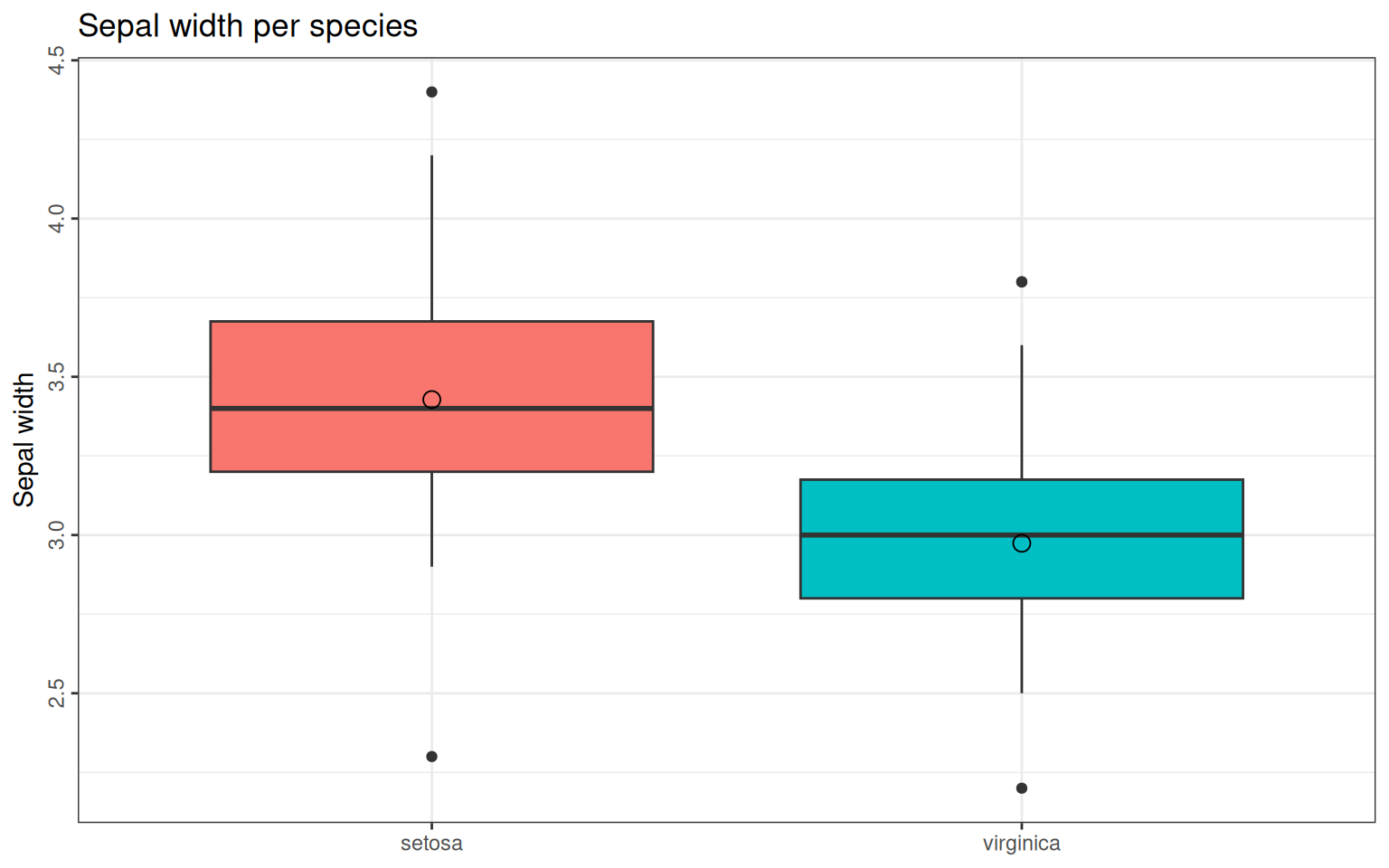
17.0.2 Exercises: ggplot2
See Section 18.0.45 for solutions.
- Load the dataset “CO2” from the datasets-library. It contains the following columns: Plant: unique identifier for each plant Type: origin of the plant Treatment: a factor with levels “nonchilled” and “chilled” conc: carbon dioxide concentrations (mL/L) uptake: carbon dioxide uptake rates (µmol/m^2 sec)
Plot the CO2-concentration (x) against the CO2-uptake (y) in a scatter-plot. The points should be colored by the origin of the plant. Add a title and axis-labels.
- Use
facet_wrapto group the plot from exercise 1 by Treatment and add a smoothing line (no model specified) for each treatment.