9.1 Multiple Data sets
Often we want to compare multiple data sets in a plot. Here you’ll learn the basics of doing so: adding data to an existing plot and providing a legend.
9.1.1 Adding data to a plot
Every time the plot function is called, a new plot is created. To add more data to an already existing plot, you use the commands points() or lines(). The type arguments can also be provided to those functions. Let’s look at an example:
> x <- seq(0,100, length.out=10)
> y <- log(x) + (x/100)^5
> plot(x, y)
> lines(x, y+1, col='purple', lwd=0.5)
> points(x, y-1, type='b', pch="g", cex=2, col="lightseagreen")
9.1.2 Legends
When plotting something, you might want to add a legend to facilitate the interpretation of your plot. In R, this is done with the legend() function. Three sets fo arguments are required:
The first argument(s) are the position of the legend. You may provide the location to put the legend either using 1) a word such as ‘top’, ‘bottom’, ‘topleft’ and so forth, or 2) the x and y coordinates of the legend.
The argument
legendis used to specify the labels to be printed in the legend.The formatting to be shown for the different labels. For this, you use the same arguments as for plotting, namely
col,lwd,lty, andpch, with one element per label entry. Here is an example:
> x <- seq(0,100, length.out=10)
> y <- log(x) + (x/100)^5
> plot(x,y, type="l", lwd=3, col="dodgerblue")
> lines(x,y+1, type='b', lwd=0.5, lty=2, pch=2, col="orange2")
> points(x,y-1, pch=19, col="firebrick")
> legend("topleft", legend = c("Dataset 1", "Dataset 2","Dataset 3"), lwd=c(3, 0.5, 1), col=c("dodgerblue", "orange2","firebrick"), lty=c(1, 2, NA), pch=c(NA, 2, 19))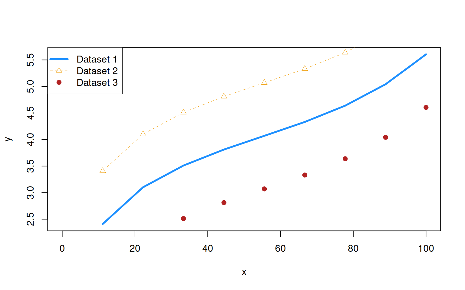
Note that using lty=NA and pch=NA implies no line or plotting character.
There are many more options that can be used with legend(), including bty that indicates the type of the box drawn around the legend (use bty='n' to have no box) or horiz to have the labels organized horizontally rather than vertically. Check ?legend for a more comprehensive list.
9.1.3 Axis
R adds nice axes by default, but sometimes we may want to fiddle with them. Good reasons are deception, highlighting specific locations, using multiple axes of opposite sides, or referring to a transformation such as log() more intuitively. Axis can be added using the function axis() that takes the following main arguments:
sidewhich denotes the site on which to plot the axis.side=1refers to the x-axis (bottom),side=2to the y-axis (left) andside=3andside=4to the top and right, respectively.atdenotes the values at which to draw an axis.labelsprovides the labels to be printed.
In order to make use of it, you may need to turn default axis printing off. You can do so by setting xaxt= 'n' and / or yaxt='n'. Here is an example:
> x <- 1:10
> y <- c(0.0041, 0.034, 0.565, 1.01, 5.2, 21.7, 91.8, 1278, 60756, 132785)
> plot(x, log10(y), yaxt='n', type='b', pch=15, ylab="y")
> at <- seq(-2, 4, by=2)
> axis(side=2, at=at, 10^at, las=1)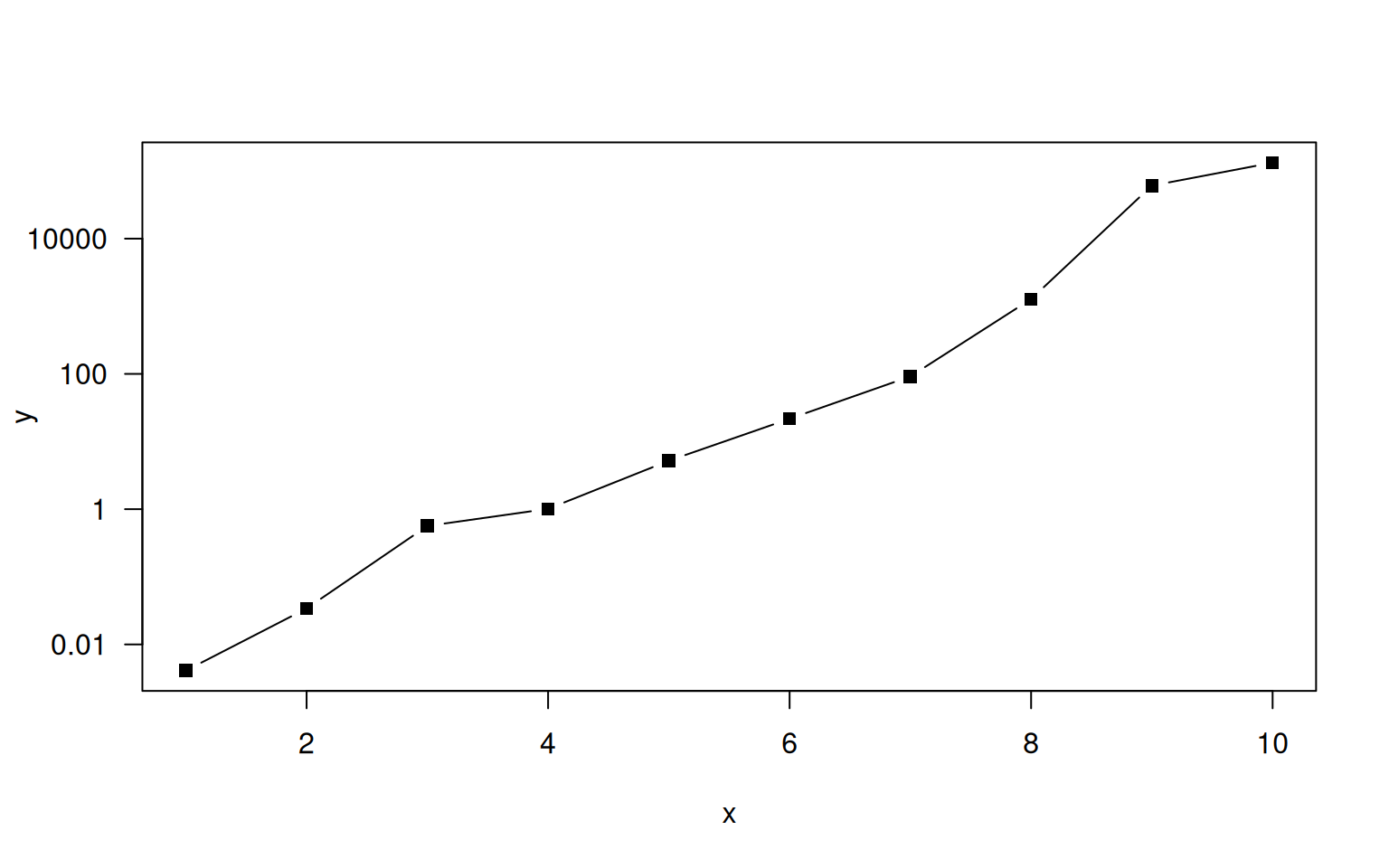
Since choosing nice values for tick marks and labels is an art, R offers the function pretty() to produce pretty labels.
Sometimes we wish to plot multiple data sets in one plot even if they use different units. A classic example are climate diagrams that plot both temperature and rainfall. To plot data on multiple axis, some calculations are required since the plot has only one unique coordinate system. Plotting data in a new axis therefore requires to scale the additional data (and the corresponding axis) to the coordinate system of the plot.
Below is an example with the climate data from https://en.wikipedia.org/wiki/Fribourg:
> temp <- c(-0.9, 0.5, 3.9, 7.5, 11.6, 15, 17, 16.5, 13.7, 8.8, 3.8, 0.3)
> rain <- c(75, 70, 63, 64, 77, 95, 85, 111, 81, 63, 85, 75)
> par(las=1, mar=c(4,4,0.5,4))
> plot(1:12, temp, type='b', col='red', pch=19, xlab="Month", ylab="Average temperature [°C]")
> scale <- 10
> lines(1:12, rain / scale, type='b', col='blue', pch=16)
> labels <- pretty(0:max(rain))
> axis(side=4, at=labels / scale, labels=labels)
> mtext("Average rainfall [mm]", side=4, line=3, las=3)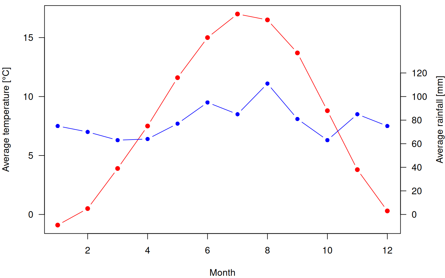
9.1.4 Adding Text to a Plot
In addition to lines() and points(), you may also add text to a plot using the function text() that takes the coordinates where text is to be put, followed by the argument labels that specifies the labels to be printed.
Before illustrating this, let us introduce another important concept: empty plots. You can generate an empty plot with plot() by setting type='n' (n for none). Creating empty plots is particularly helpful when building up plots using loops. But back to text():
> plot(0, type='n', xlim=c(-10, 10), ylim=c(-10, 10))
> text(-9:9, -9:9, labels=paste("Number", -9:9))
We may also use the text() call to add extra legends to the plot. For instance, we might want to indicate the correlation between two data sets in the top left corner. Remember that we can use the par("usr") call to get the coordinates of the plot, allowing us to add text at fixed visual positions regardless of the xlim and ylim choices.
> x <- c(0.17, 0.63, 0.37, 0.94, 0.73, 0.74, 0.33, 0.36, 0.65, 0.82, 0.29, 0.13, 0.85, 0.21, 0.30, 0.35, 0.66, 0.53, 0.92, 0.44)
> y <- c(0.25, 0.59, 0.23, 1.00, 0.74, 0.69, 0.34, 0.56, 0.64, 0.79, 0.62, 0.13, 0.90, 0.19, 0.19, 0.27, 0.68, 0.62, 1.02, 0.52)
> plot(x, y)
> text(par("usr")[1], par("usr")[3] + 0.95 * (par("usr")[4]-par("usr")[3]), labels=paste("cor =", round(cor(x,y),2)), pos=4)
9.1.5 Reference lines
For readability, it is sometimes helpful to add reference lines to a plot. Here we consider two types of reference lines: grids and, well, reference lines.
Let’s start with the grid. You can add a grid using the function grid() that will place fine dashed lines at the values indicated by tick marks. It takes all all sorts of arguments, including lty and col, and a way to choose the number of grid lines to draw.
In some cases, you may just want to add specific lines. This is easily done with abline that plots straingt lines to a plot.
- To plot horizontal lines, use the argument
hto specify the y-values. - To plot vertical lines, use the argument
vto specify the x-values. - To plot any other line, use either
aandbdenoting the intercept and slope, orcoefto provide a vector of length two with said values.
> plot(0, type='n', xlim=c(-1,1), ylim=c(-1,1))
> abline(v=0, col='red')
> abline(h=c(-0.5,0.5), col='blue')
> abline(a=0, b=1, col='purple')
> abline(coef=c(0,-1), col='orange2')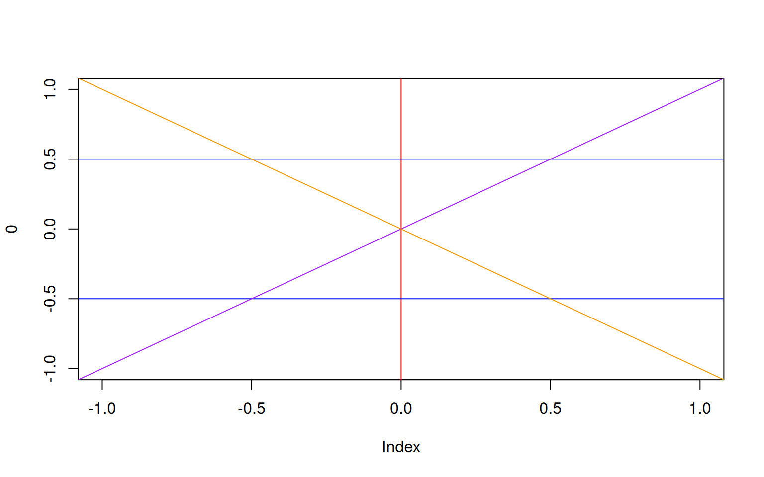
9.1.6 Exercises: Plotting
See Section 18.0.23 for solutions.
Create a data frame with three columns x, y, and z as follows: x contains a vector with 1.0, 1.5, 2.0, 2.5, … 100, each element of y is \(y_i=\sqrt(x_i)\), and each element of z is \(z_i=log(x_i)\). Plot y and z against x in the same plot, using a red solid line for y and a blue dashed line for z. Add the axis labels “x” and “A transformation of x” and a legend specifying the transformation.
Open an empty plot with
xlim=c(-10,10)andylim=c(-1,1)and axis labels “x” and “y”. Plot a vertical and a horizontal dashed red line crossing the oprigin (0,0). Put the Roman numbers I, II, III and IV to name the https://en.wikipedia.org/wiki/Quadrant_(plane_geometry).Plot a climate diagram for Bagui, Central African replublic showing the average daily high temperature
av.high <- c(32, 34, 34, 32, 32, 30, 32, 30, 30, 30, 32, 32)and the average percipitationav.rain <- (16, 31, 104, 131, 161, 155, 193, 225, 192, 199, 76, 27). Put the two quantities on seperate axis and make sure that their maximum is at the same height in the plot. Add a legend.