10.1 Plotting empirical distribution
Above we have seen how to plot theoretical probability distributions. But we might be equally interested in visualizing some empirical distributions. Here we will introduce a few ways to do that.
10.1.1 Histograms
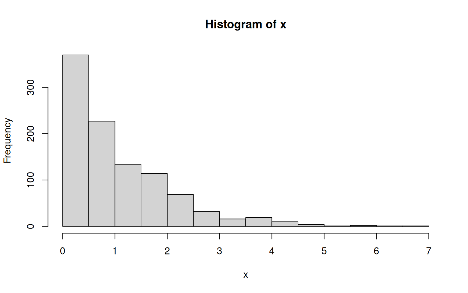
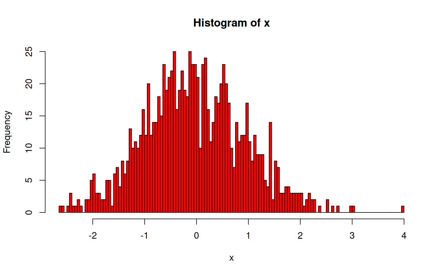
A common way to plot empirical distributions is via histograms. A histogram is basically a barplot in which each bar represents the fraction of values that fall within a particular bin. Building a histogram thus implies three steps: 1) deciding on the bins to use, 2) counting how many values fall within each bin, and 3) plotting these counts (or fractions) as a barplot.
The function hist() does all that.
However, the optional arguments of hist() still allow for a fine control:
breaks: specifies how bins are to be formed. It either takes a vector of break-points, the number of desired break-points, or some indication of how to compute break-points from the data. The default is a method introduced by H.A. Sturges in 1926 - still the best around.freq: whenTRUE, frequencies (i.e. counts) are plotted, whenFALSE, densities (i.e. fractions) are used.And pretty much all graphical parameters such as
colwork too.
10.1.2 Kernel Density Estimation
Estimating probability densities from continuous numbers always involves the challenge that for any given value there are usually zero observations. Thus, densities can only reasonably be computed from values within an interval. The histogram introduced above is a way to do that: it partitions the space into a number of non-overlapping bins and calculates the density of each by counting the number of values that fall within each bin. By doing so it makes the assumption that all values within a bin are equally important to estimate its density, but any point outside of that interval is meaningless, no matter how close it is to the bin boundary.
Yes, that seems draconian: two points can be arbitrarily close to each other, but if they are on opposite sides of the boundary, one is given full weight and the other none.
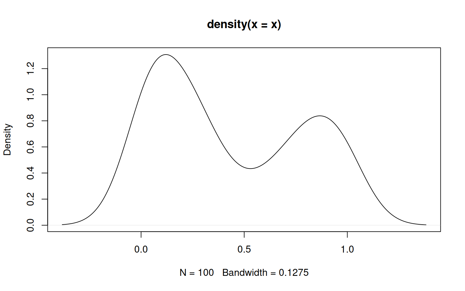
However, there are also other ways to estimate densities that use other metrics. A popular alternative (that is by no means less arbitrary) is kernel density estimation that uses some kernel function to give weight to values based on how far away they are of the location at which you want to estimate the density. In R, the function density() performs this task.
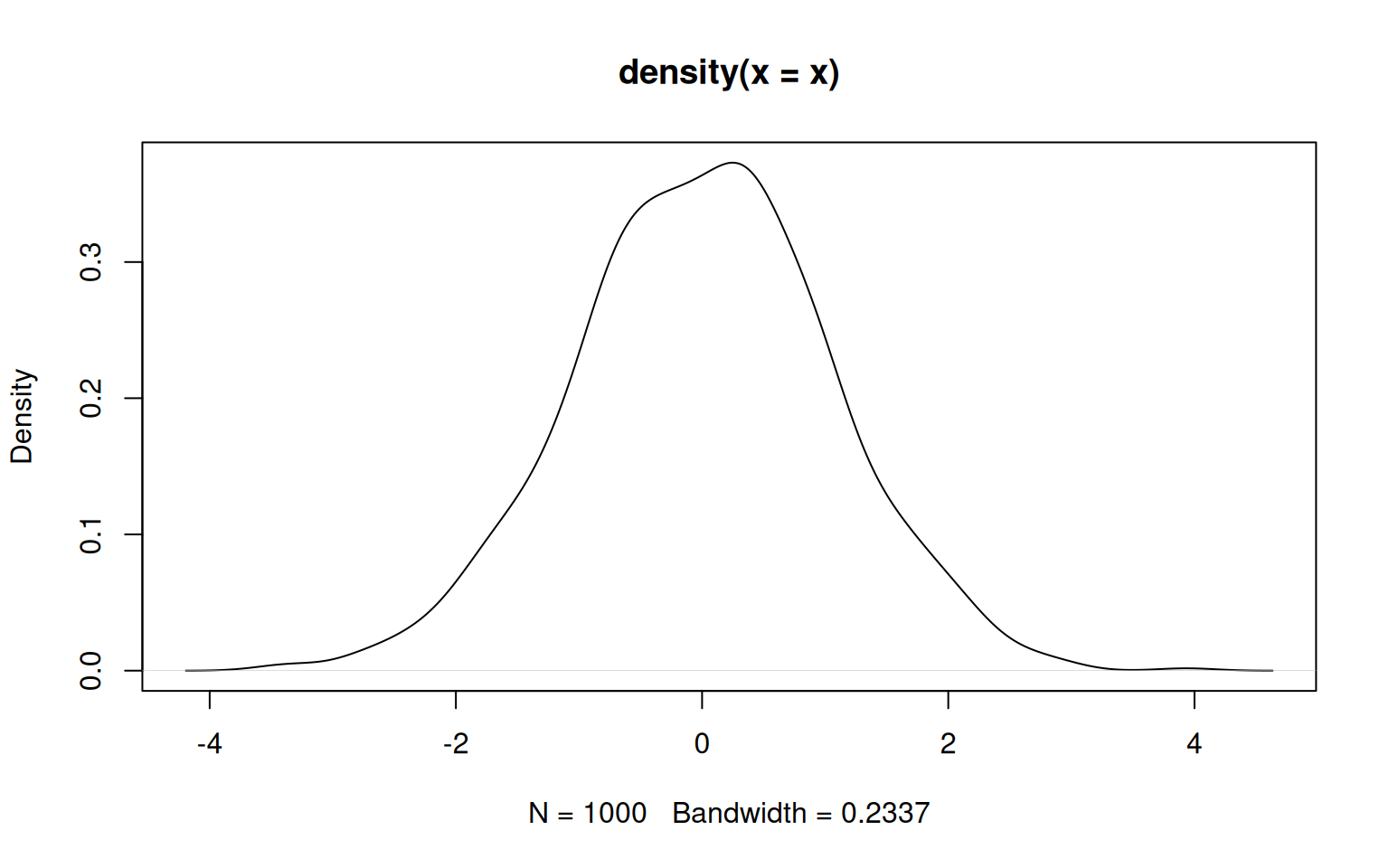
The key parameter is the bandwidth (argument bw), which indicates how broad the distribution giving weight should be. A wide distribution (i.e. a large bandwith) gives some weight to points even far away from the location at which the density is estimated. A narrow distribution (i.e. a small bandwidth) gives meaningful weights only to values rather close to that location. The choice of the bandwidth therefore affects the smoothing a lot.
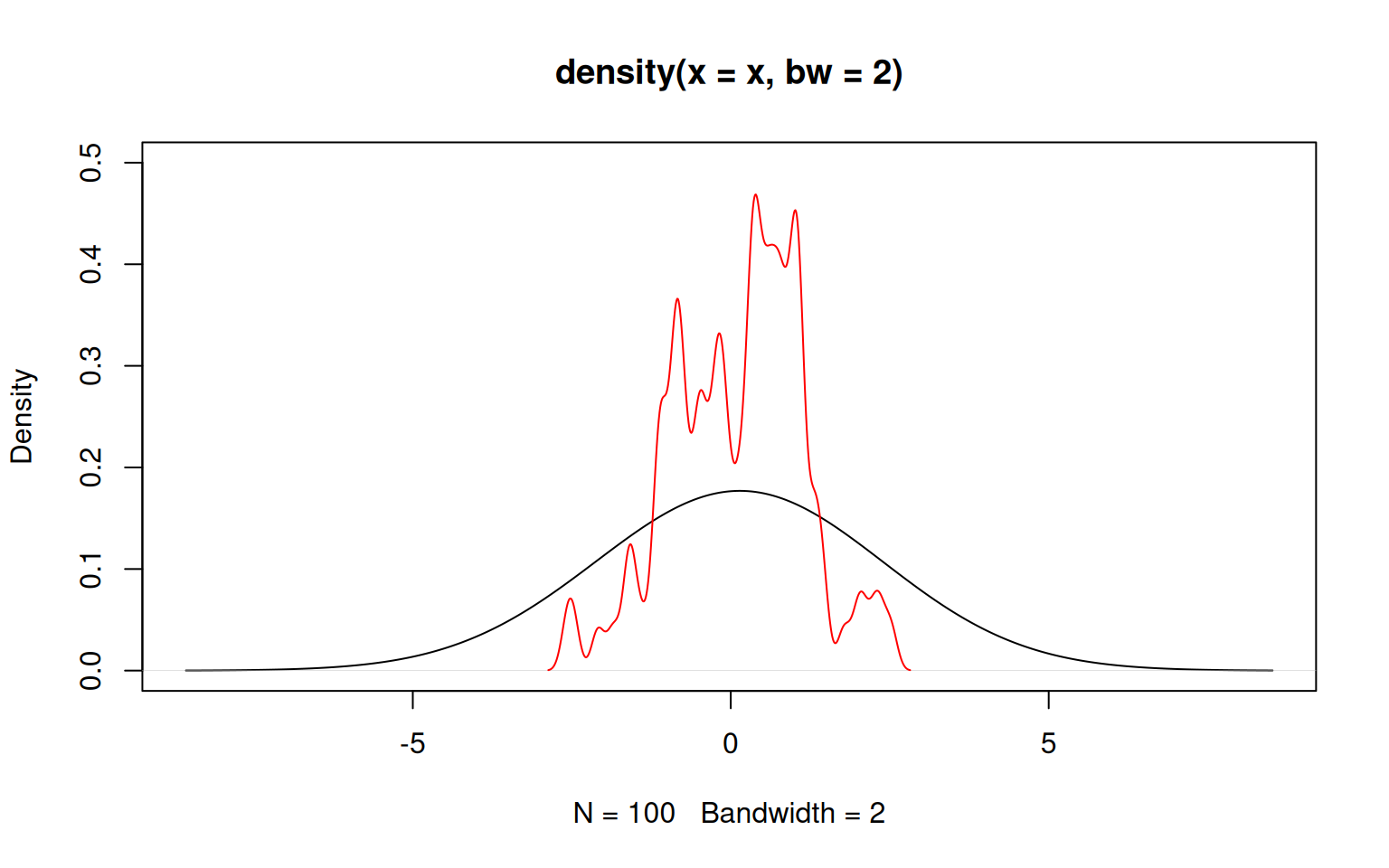
Luckily, R implements a clever algorithm to decide on an optimal bandwith and it is usually not advised to tinker too much with its choice. Rather, one might simply increase or decrease the proposed bandwith slightly using the argument adjust.
Just as histograms, kernel density estimation also has its drawbacks: it is particularly inaccurate at boundaries. As an example, consider samples from a beta distribution, which is only defined between 0 and 1.
If the limits are known, they may be provided to density() using the arguments from and to. However, in such cases the histogram is usually a better way to represent the data, as illustrated in the following where the density estimates are compared against the theoretical density function given as a solid red line.
> r <- rbeta(500, shape1=0.5, shape2=0.7)
> par(mfrow=c(1,2))
> plot(density(r, from=0, to=1))
> x <- seq(0, 1, length.out=100)
> lines(x, dbeta(x, shape1=0.5, shape2=0.7), col='red')
> hist(r, freq=FALSE)
> lines(x, dbeta(x, shape1=0.5, shape2=0.7), col='red')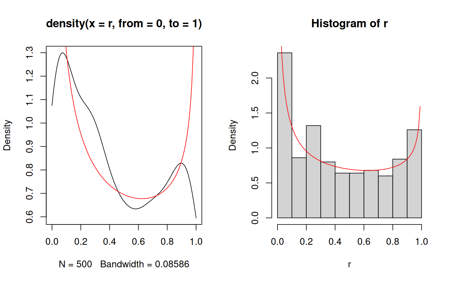
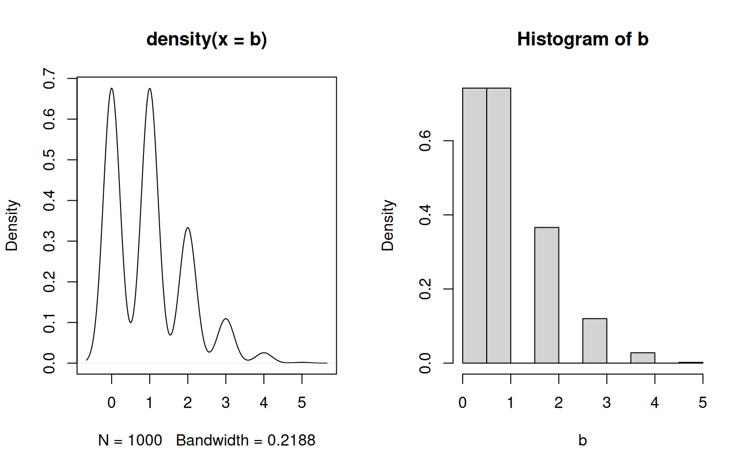
Another example are discrete distributions.
In conclusion: both histograms and density plots are fair ways to visualize empirical distributions, but inferring probability densities is generally a dirty business.
10.1.3 Exercises: Empirical Distributions
See Section 18.0.27 for solutions.
Simulate \(10^3\) values from a binomial distribution with sample size 5 and probability of success \(p=0.2\). Visualize the empirical distribution using both a histogram and kernel density smoothing. Which one would you use?
Plot the theoretical probability density function of a normal distribution with mean 10 and standard deviation 2 as a solid red line. Randomly sample \(10^1\), \(10^2\), \(10^3\), \(10^4\) and \(10^5\) values from this normal distribution, and add the kernel density estimates on the same plot in black using different line types. Add a legend.
Load the built-in iris data set with
data("iris"). R will store the data set into the variableiris, and you can inspect the data e.g. withhead(iris). Plot a separate histogram of petal lengths for each of the three species setosa, versicolor and virginica. Next, create a new plot containing the kernel density estimation for all three species together as a solid black line. Add lines for the kernel density estimation for each species separately to your plot, using different colors. Add a legend.